Slug Plot
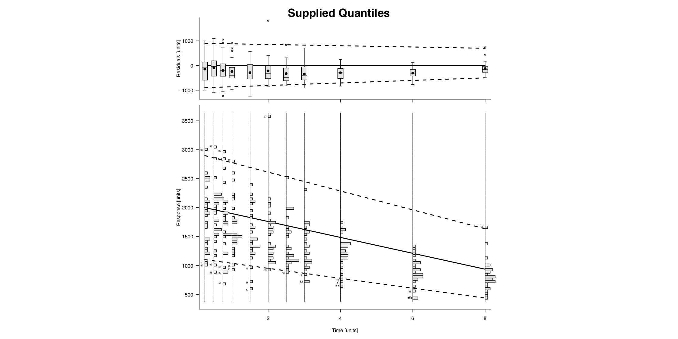
Example - Supplied Quantiles
Code Used
#pdf(file="F:/Website/slug/supplied-slug-large.pdf", width = 15, height = 7.5)
Import
Data
Data
### Import Data
data.to.plot <- bolus
dose <- 120000

data.to.plot <- data.to.plot[data.to.plot["AMT"]==0 &
    data.to.plot["MDV"]==0 & data.to.plot["DOSE"] == dose,]
data.to.plot <- data.to.plot[data.to.plot["TIME"] <= 10,]

sequence <- unique(data.to.plot[,"TIME"])
#print(sequence)
range.start <- range(data.to.plot[data.to.plot$TIME == sequence[1],"DV"])
range.finish <- range(data.to.plot[data.to.plot$TIME == sequence[length(sequence)],"DV"])
m <- c((range.start[2]-range.finish[2])/(sequence[1] - sequence[length(sequence)]))

calculate.y <- function(x0,x1,y0,m,b){
	y1 <- -m*(x0-x1) + y0
	y1
}

#print(range.start);print(range.finish);print(m)
quantile.data.to.plot <- sapply(
	sequence,
	function(x,xstart = sequence[1], yrange = range.start, slope = m){

		upper <- calculate.y(x0 = xstart, x1 = x, y0 = 0.95*diff(yrange)+yrange[1],m = 0.95*slope)
		middle <- calculate.y(x0 = xstart, x1 = x, y0 = 0.50*diff(yrange)+yrange[1],m = 0.8*slope)
		lower <- calculate.y(x0 = xstart, x1 = x, y0 = 0.05*diff(yrange)+yrange[1],m = 0.5*slope)
		cbind(lower,middle,upper)
	}
)
quantile.data.to.plot <- t(quantile.data.to.plot)
colnames(quantile.data.to.plot) <- c("lower","middle","upper")


### End Import
Set up/Plot
the graph
the graph
### Make Slug Plot
plot.slug(
  column.x = "TIME",
  column.y = "DV",
  outlier.ids = "ID",
  data = data.to.plot,
  quantile.data = quantile.data.to.plot,
  quantile.lines = c("lower","middle","upper"), #Fake, 'fun' lines that I made up
  xlab = "Time [units]",
  ylab1 = "Response [units]",
  ylab2 = "Residuals [units]",
  main = "Supplied Quantiles",
)
#dev.off()