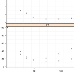
Scatter Plot
Basic Form
Uses

- To display "Scatter Plot" plots according to a time profile
Notes
- Should be plotted with TIME on the X axis
- All Data being plotted must satisfy all requirement within the 'Data Sets' tab to work properly
- MORE NOTES
Common Examples
- Points
- Points and Lines
- Points and 95% Confidence Interval
- Points and Mean Line
- Points, Lines, and Administration Time
Base Code for All Scatter Plot Examples
Import
Data
Data
### Import Data
  data <- warfarin.mdvpk.1
  split.column <- "AGE"

  data <- data[data$DOSE == 120,]

  data.select <- data[ data$MDV == 0 & data$AMT == 0, ]
    ### Rows where MDV == 0 and AMT == 0  (Good Rows for plotting x,y)

  data.to.plot <- list()

  data.to.plot$x <- data.select[,"TIME"]  #x
  data.to.plot$y <- data.select[,"DV"]  #y
  data.to.plot$ids <- data.select[,"ID"]  #ids

  data.to.plot$criteria <- data.select[,split.column]

  x.min.lim <- 0
  x.max.lim <- 150
  y.min.lim <- 0
  y.max.lim <- max(data.to.plot[["y"]])
  data.to.plot$x.lim <- c(x.min.lim,x.max.lim)
  data.to.plot$y.lim <- c(y.min.lim,y.max.lim)

  bw <- FALSE

  library(lattice)
### End Import
Where the data
is plotted
is plotted
### Panel Function

  function.of.panel <- function(
    x,
    y,
    groups = groups,
    data.to.plot.in.panel = data.to.plot,
    black.and.white.in.panel = bw,
    subscripts
  ){
  cat("\n\n\nPacket", packet.number(),"\n")

  #### Grid
    plot.grid(
      x.divisions = 10,
      y.divisions = 10,
      grid.color = "grey95",
      x.limits = data.to.plot.in.panel[["x.lim"]],
      y.limits = data.to.plot.in.panel[["y.lim"]]
    )

  ### Plot Points
    plot.points(
      points.x = x,
      points.y = y,
      points.symbol = "x",
      points.size = 1,
      points.color = "black"
    )

  ### ... More Panel Functions...
  ### Will be plotted in the order the functions are performed

  }

### End Panel
Set up the
graph
graph
### Make Scatter Plot
  lat.scatter <- xyplot(
    y ~ x | as.factor(criteria),
      # Remove '| as.factor(criteria)' if you do not want to split the data
    data = data.to.plot,
    type = NULL,
      # Taken Care of in Panel
    aspect=.5,
      # X is twice as long as Y
    groups = ids,
    xlab = "X Label",
    ylab = "Y Label",
    xlim = c(
      x.min.lim - 0.03*(x.max.lim-x.min.lim)*0.5,
      x.max.lim + 0.03*(x.max.lim-x.min.lim)*0.5
    ),
      # *0.5 is to compensate for the aspect ratio (aspect)
    ylim = c(
      y.min.lim - 0.03*(y.max.lim-y.min.lim),
      y.max.lim + 0.03*(y.max.lim-y.min.lim)
    ),
    main = "TITLE",
    panel = function.of.panel,

    ### Key contains suggested variations in a recommended plotting order
    key = list(
      title = "Legend",
      text = list(
        c("Administration Range", "ID Lines", "Mean Line", "Loess Line","Points"),
        col="black"
      ),
      points = list(
        col = c(
          if(bw){c("grey25","black","black","black","black")
          }else{c("green",rainbow(1,start=.56,end=.55),"darkred","black","black")}
        ),
        pch = c(15,NA,NA,NA,4),
        cex = c(2,1,1,1,1)*0.75
      ),
      lines = list(
        col = c(
          if(bw){c("grey25","black","black","black","black")
          }else{c("green",rainbow(1,start=.56,end=.55),"darkred","black","black")}
        ),
        lwd = c(1,1,2,1.4,1)*0.75,
        lty = c("solid",if(bw){"dashed"}else{"solid"},"dotted","solid","blank")
      ),
      type = "l",
      space = "right",
      cex.title = 1,
      cex = 0.75
    )

  )
Color of Background
### Change Color of Trellis Device and Plot Data
  trellis.device(color = !bw,new = FALSE,retain = FALSE)
Print the Plots
### Plot Data
  print(lat.scatter)