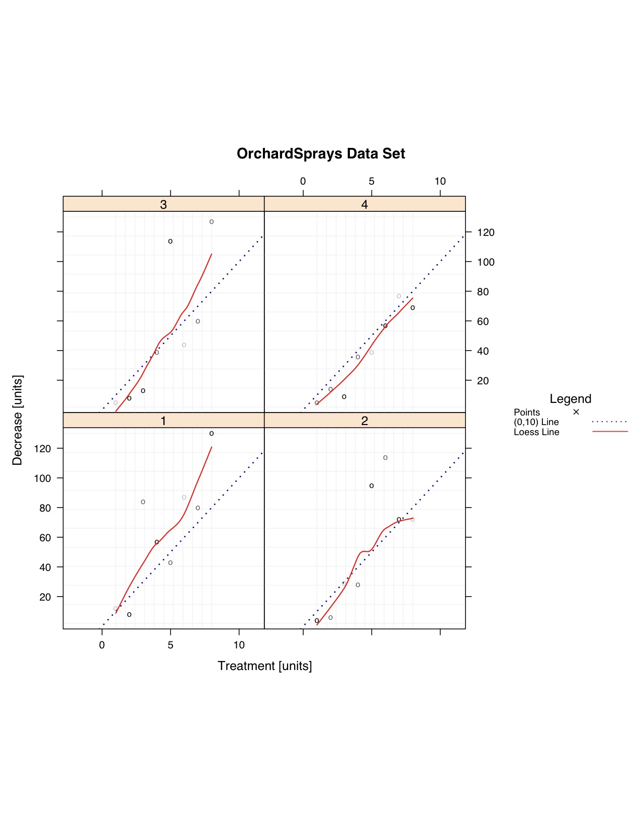
Y~Y Plot
Example - Points and a-b-line
 |
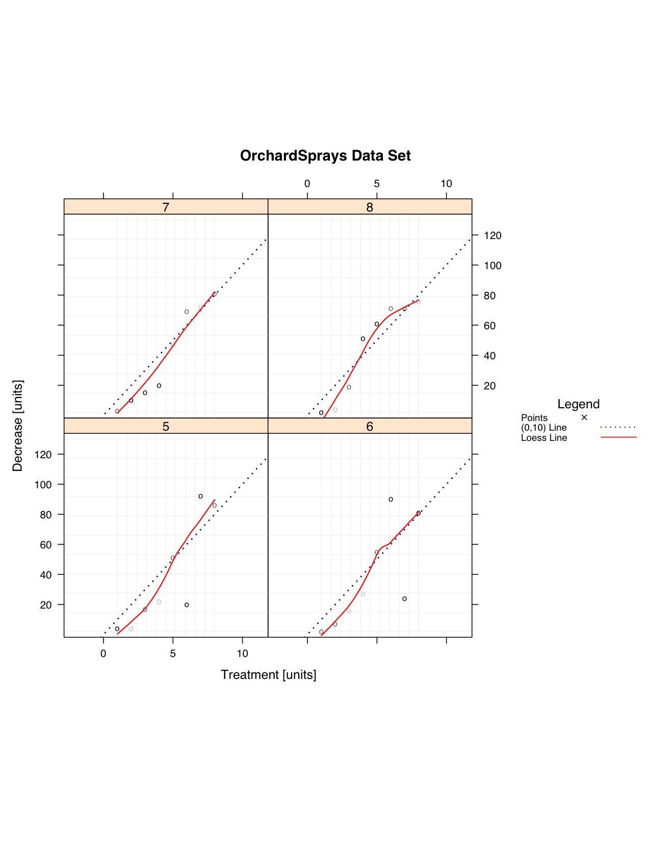 |
| Page 1 | Page 2 |
Code Used
### Using a toy data set due to example data sets not having more than one Y variable
#pdf(file="F:/Website/yyplot/lattice/latticeyy-points-abline-loess-large.pdf", width = 8.5, height = 11)

### Import Data
  data <- OrchardSprays
  split.column <- "rowpos"

  data.to.plot <- list()

  data.to.plot$x <- as.numeric(data[,"treatment"])  #x and correcting for being a factor
  data.to.plot$y <- as.numeric(data[,"decrease"])  #y
  data.to.plot$criteria <- data[,split.column]

  x.min.lim <- min(data.to.plot[["x"]])
  x.max.lim <- max(data.to.plot[["x"]])
  y.min.lim <- min(data.to.plot[["y"]])
  y.max.lim <- max(data.to.plot[["y"]])

  range.largest <- max(c(y.max.lim-y.min.lim),c(x.max.lim-x.min.lim))

  data.to.plot$x.lim <- c(x.min.lim,x.max.lim)
  data.to.plot$y.lim <- c(y.min.lim,y.max.lim)

  bw <- FALSE

  library(lattice)
### End Import

### Panel Function

  function.of.panel <- function(
    x,
    y,
    data.to.plot.in.panel = data.to.plot,
    black.and.white.in.panel = bw,
    subscripts
  ){
  cat("\n\n\nPacket", packet.number(),"\n")

  #### Grid
    plot.grid(
      x.divisions = 10,
      y.divisions = 10,
      grid.color = "grey95",
      x.limits = data.to.plot.in.panel[["x.lim"]],
      y.limits = data.to.plot.in.panel[["y.lim"]]
    )

  ### Plot Points
    plot.points(
      points.x = x,
      points.y = y,
      points.symbol = "o",
      points.size = 1,
      points.color = color.gen("black","grey75",3)
    )

  ### a-b-line
    plot.abline(
      intercept = 0,
      slope = 10,
      black.and.white = black.and.white.in.panel
    )

  ### Loess Line
    plot.loess(
      points.x = x,
      points.y = y,
      line.thickness = 1.4,
      line.style = "solid",
      line.color = "red",
      line.span = 5/6
    )

  }

### End Panel

### Make Y~Y Plot
  lat.yy <- xyplot(
    y ~ x | as.factor(criteria),
      # remove '| as.factor(criteria)' if do not want to split the data
    data = data.to.plot,
    type = NULL,
      # Taken Care of in Panel
    aspect=1,
      # X length is the same as the Y length.  It produces a square box.
#    aspect="iso",
      # X units have the same length as Y units, does not mean aspect = 1.
      # Most likely will produce a rectangular shape
    xlab = "Treatment [units]",
    ylab = "Decrease [units]",
    xlim = c(x.min.lim - 0.03*(range.largest),x.max.lim + 0.03*(range.largest)),
    ylim = c(y.min.lim - 0.03*(range.largest), y.max.lim + 0.03*(range.largest)),
    main = "OrchardSprays Data Set",
    layout = c(2,2,2),
      # 2 columns, 2 rows, 2 pages
    panel = function.of.panel,

    ### Key contains suggested variations in a recommended plotting order
    key = list(
      title = "Legend",
      text = list(
        c("Points","(0,10) Line", "Loess Line"),
        col="black"
      ),
      points = list(
        col = c("black",if(bw){"black"}else{"darkblue"},"red"),
        pch = c(4,NA,NA),
        cex = c(1)*0.75
      ),
      lines = list(
        col = c("black",if(bw){"black"}else{"darkblue"},"red"),
        lwd = c(1,2,1.4)*0.75,
        lty = c("blank","dotted","solid")
      ),
      type = "l",
      space = "right",
      cex.title = 1,
      cex = 0.75
    )

  )

### Change Color of Trellis Device and Plot Data
  trellis.device(color = !bw,new = FALSE,retain = FALSE)

### Plot Data
  print(lat.yy)

#dev.off()