Y~Y Plot
Example - Points
 |
Code Used
### Using a toy data set due to example data sets not having more than one Y variable
#pdf(file="F:/Website/yyplot/lattice/latticeyy-points-large.pdf", width = 8.5, height = 11)
Import
Data
Data
### Import Data
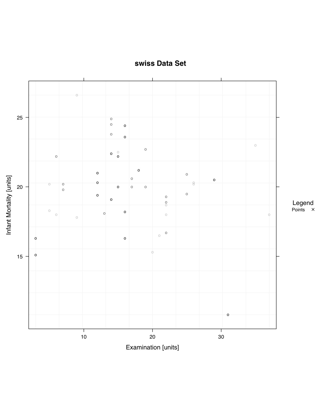
data <- swiss
# split.column <- NULL # |as.factor(criteria) was removed
data.to.plot <- list()
data.to.plot$x <- data[,"Examination"] #x
data.to.plot$y <- data[,"Infant.Mortality"] #y
# data is not being split
x.min.lim <- min(data.to.plot[["x"]])
x.max.lim <- max(data.to.plot[["x"]])
y.min.lim <- min(data.to.plot[["y"]])
y.max.lim <- max(data.to.plot[["y"]])
range.largest <- max(c(y.max.lim-y.min.lim),c(x.max.lim-x.min.lim))
data.to.plot$x.lim <- c(x.min.lim,x.max.lim)
data.to.plot$y.lim <- c(y.min.lim,y.max.lim)
bw <- FALSE
library(lattice)
### End ImportWhere the data
is plotted
is plotted
### Panel Function

  function.of.panel <- function(
    x,
    y,
    data.to.plot.in.panel = data.to.plot,
    black.and.white.in.panel = bw,
    subscripts
  ){
  cat("\n\n\nPacket", packet.number(),"\n")

  #### Grid
    plot.grid(
      x.divisions = 10,
      y.divisions = 10,
      grid.color = "grey95",
      x.limits = data.to.plot.in.panel[["x.lim"]],
      y.limits = data.to.plot.in.panel[["y.lim"]]
    )

  ### Plot Points
    plot.points(
      points.x = x,
      points.y = y,
      points.symbol = "o",
      points.size = 1,
      points.color = color.gen("black","grey75",3)
    )

  ### ... More Panel Functions...
  ### Will be plotted in the order the functions are performed

  }

### End Panel
Set up the
graph
graph
### Make Y~Y Plot
  lat.yy <- xyplot(
    y ~ x,
      # Add '| as.factor(criteria)' if you would like to split the data
    data = data.to.plot,
    type = NULL,
      # Taken Care of in Panel
    aspect=1,
      # X length is the same as the Y length.  It produces a square box.
#    aspect="iso",
      # X units have the same length as Y units, does not mean aspect = 1.
      # Most likely will produce a rectangular shape
    xlab = "Examination [units]",
    ylab = "Infant Mortality [units]",
    xlim = c(x.min.lim - 0.03*(range.largest),x.max.lim + 0.03*(range.largest)),
    ylim = c(y.min.lim - 0.03*(range.largest), y.max.lim + 0.03*(range.largest)),
    main = "swiss Data Set",
    panel = function.of.panel,

    ### Key contains suggested variations in a recommended plotting order
    key = list(
      title = "Legend",
      text = list(
        c("Points"),
        col="black"
      ),
      points = list(
        col = c("black"),
        pch = c(4),
        cex = c(1)*0.75
      ),
      type = "l",
      space = "right",
      cex.title = 1,
      cex = 0.75
    )

  )
Color of Background
### Change Color of Trellis Device and Plot Data
  trellis.device(color = !bw,new = FALSE,retain = FALSE)
Print the Plots
### Plot Data
  print(lat.yy)
#dev.off()